- Product Rollout
Prepaid Migration Experience Redesign
This project wasn’t a typical product enhancement. It was a high-stakes customer transition that could easily be interpreted as a forced downgrade. For StarHub, these customers represented a core base — and with 500K users impacted, even small friction in communication or onboarding could lead to: loss of trust, complaint spikes, customer resistance to change, churn risk and significant cost-to-serve (call center + retail support)
create a migration experience that felt seamless, transparent, and reassuring, while clearly communicating that the new prepaid plans were better overall.

The Experience Challenge: Key Complexity
Plan migrations are emotional moments for customers. Even when a change is positioned as an upgrade, users often interpret it as a downgrade or a cost-driven move by the company. This was amplified by the scale and visibility of this initiative—500,000 customers represented a core user base, and poor migration communication could have triggered complaint spikes, call center load, and brand trust erosion.
Complicating this further was a key experience constraint: the new enhanced plan would not work with the old postpaid app. This meant users could not “remain where they were.” Even if the migration itself was seamless behind the scenes, customers still needed to understand what was happening, download a new app, and successfully log in to confirm their plan, usage and balance. From a customer perspective, this was not simply a plan upgrade—it was a change of system, identity flow and mental model.
Objectives
Business objectives
Migrate 500K users with minimal risk
Maintain customer satisfaction + trust during a forced change
Reduce avoidable service and support escalations
Experience objectives
Make the change clear, calm, and credible
Replace anxiety with reassurance + guidance
Frame migration as an upgrade with customer value
Create onboarding that works for low-literacy and non-technical segments
Rollout Strategy (Risk-managed Experience Delivery)
To reduce risk and validate stability, the migration was planned in controlled waves:
Test systems + journey clarity
Wave 1: 10K customers (1 week)
Wave 2: 190K customers (1 week) – expand with confidence + learnings
Wave 3: 300K customers (1 week) – full rollout at scale
This phased rollout reinforced a core design principle:
Trust is built by reducing uncertainty — operationally and experientially.
Research & Insights (Grounded in Real Behavior)
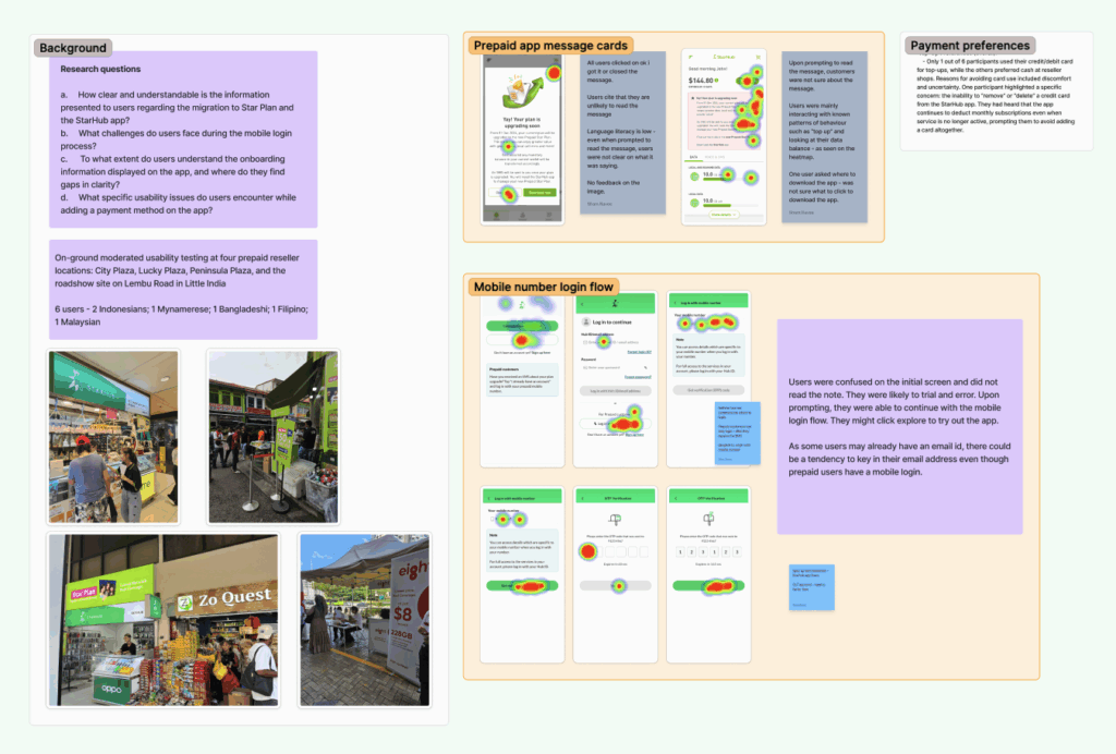
To ensure the migration experience was grounded in real customer behavior—not assumptions—we conducted on-ground moderated usability testing with users reflecting prepaid segment behaviors and real-world literacy levels. The research was conducted in prepaid reseller environments where we could observe how users interpret information, act under uncertainty, and navigate common flows such as login, onboarding comprehension, and payment/top-up behavior.
Across research sessions, a key pattern emerged: many users struggled to deeply process text-heavy instructions. Migration-related communication was often skimmed or ignored entirely, especially when presented as dense paragraphs. Users with lower language literacy tended to “tap through” or close pop-ups quickly, relying on trial and error rather than reading. This highlighted that clarity could not be solved by copy alone—communication had to become more visual, structured, and behavior-led.
We also observed that users frequently misunderstood dashboard concepts such as wallet balance, data balance, and credits, misinterpreting them as the “main” dashboard state. Payment and top-up flows were not intuitive unless presented contextually—users were unlikely to proactively add payment methods early unless they faced an immediate reason (e.g., low credit or upcoming renewal). These findings shaped the experience direction toward progressive disclosure, contextual actions, and guided onboarding rather than informational overload.
Journey Architecture (End-to-End Experience Design)
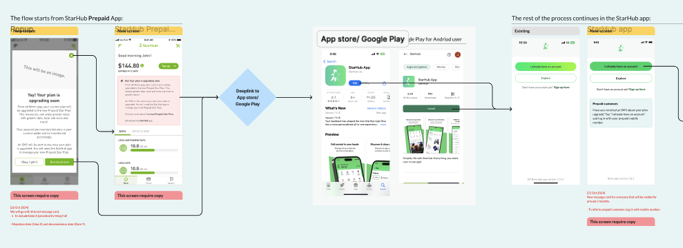
Rather than treating this as a single screen redesign, the migration was approached as a complete experience journey spanning multiple touchpoints. The strategy focused on sequencing information at the right moments: first building awareness in the old postpaid app, then creating a structured migration information hub to reduce uncertainty, then guiding customers to the App Store as the conversion step, and finally supporting a segment-specific onboarding experience inside the new StarHub app.
This approach ensured continuity and reduced drop-off risk. Each stage of the journey was designed with a clear job-to-be-done: reduce surprise, provide reassurance, guide action, confirm success, and reinforce perceived value. The experience needed to meet customers at the exact moments where confusion or anxiety would spike—and defuse those moments through strong information hierarchy and guidance.
Experience Solution (What We Designed)
Solution: Old App Migration Communication
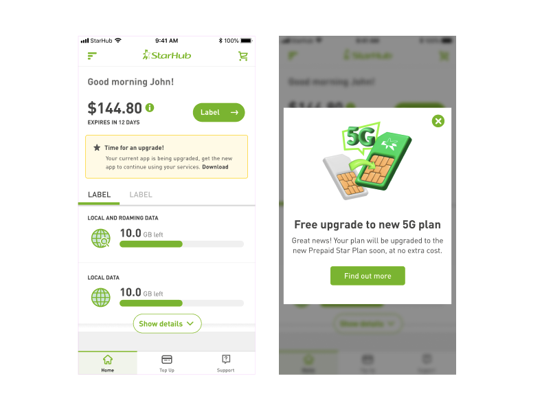
Within the old postpaid app environment—where customers were already managing usage and payments—we introduced upgrade messaging to remind users that their plan would be migrated and that a new app experience would be required. This was framed explicitly as a free upgrade, designed to reduce customer suspicion and reinforce perceived value.
A key communication asset was an in-app modal that announced the 5G plan upgrade and directed users to “Find out more.” This served as an entry point into a migration narrative that was intentionally structured and staged. Rather than forcing customers into long explanations up front, the CTA led to a dedicated page designed to answer questions and reduce uncertainty.
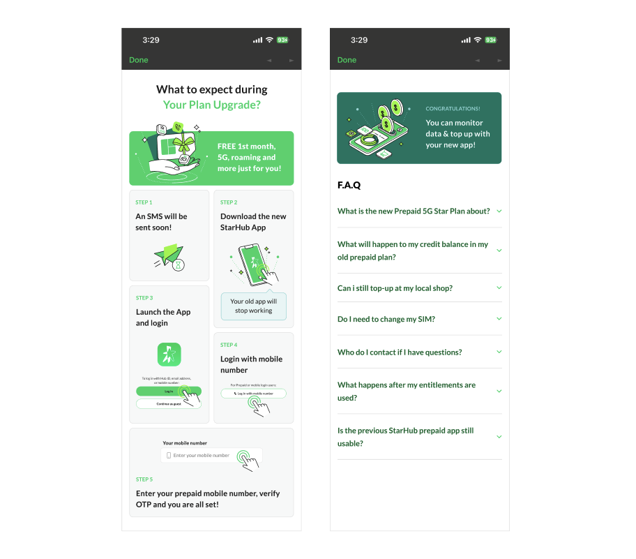
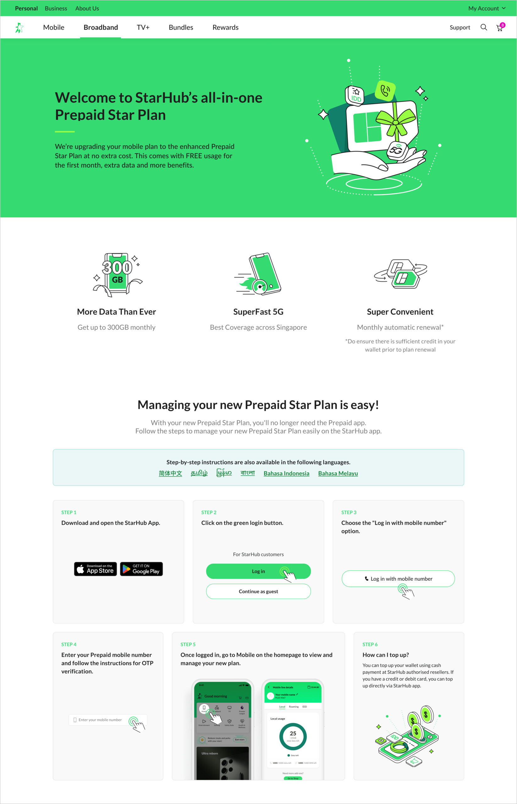
Solution: Migration Info Hub + FAQs
From the modal, customers were taken to a structured information hub (“About your 5G Plan Upgrade”) designed to guide understanding and reduce support dependency. The page framed the upgrade benefits clearly (5G at no extra cost, improved roaming/IDD), then provided an explicit “What’s next” sequence that described what customers should expect: receiving an SMS, downloading the new StarHub app, logging in using mobile number/OTP, and verifying their service details.
This page also included an FAQ module to address common anxieties—credit balance continuity, SIM requirements, top-up methods, and support channels. In a migration programme of this scale, FAQs are not merely helpful content—they are a strategic experience component used to reduce uncertainty and prevent escalation into support channels.
Solution: Segment-Specific onboarding in the New App
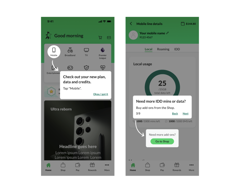
A defining feature of the migration experience was the ability to detect migrated users through their login context. Once a customer from the migrated cohort logged into the new StarHub app, the experience triggered a tailored onboarding flow specifically designed for that segment. This ensured that migrated customers received targeted guidance immediately upon landing in the new app environment, reducing the risk of confusion and abandonment.
The onboarding used tooltip-style guidance to direct users to the most critical action: verifying their new plan, usage, and credits by tapping into the Mobile section. This design choice aligned directly with research findings—users are reassured not by reading explanations, but by quickly seeing confirmation that their services are intact and upgraded. By shortening time-to-confidence, we reduced uncertainty at the most sensitive moment of the journey.
The migration was guided by brand-led experience principles centered on trust, clarity, and behavioral alignment. The system was designed with trust-first communication, ensuring that users were reassured before being instructed, reducing anxiety and perceived risk. We prioritized clarity over completeness, using structured messaging hierarchy rather than long-form plan explanations. The journey relied on visual-first guidance and progressive disclosure, reducing cognitive load and supporting customers with varied language literacy levels. We intentionally designed contextual actions, prompting top-up or payment setup only when relevant to the customer’s usage cycle. Above all, the migration was framed as a value-led upgrade, ensuring the experience felt like modernization and improvement, not disruption.
This programme rolled out after I left StarHub, so post-launch analytics were not available to me. However, the design outcomes delivered a complete migration journey capable of supporting enterprise-scale change with minimized customer friction. The experience was structured to reduce confusion through guided steps, reduce perceived disruption through upgrade framing and benefit-led messaging, and support vulnerable segments through targeted onboarding at first login. Operationally, the experience also aligned with staged rollout planning, enabling risk mitigation and stability validation as migration volume increased.
Final Thoughts
This project demonstrates strategic experience design leadership in a complex, high-stakes transformation environment where customer trust and brand credibility are directly on the line. It reflects my ability to architect end-to-end journeys across touchpoints, translating complex business transitions into human-centered digital experiences. It also highlights how research-led insights can shape messaging strategy and behavioral onboarding to reduce confusion at scale. Most importantly, it showcases enterprise execution maturity—designing not only for usability and customer reassurance, but for phased rollout readiness, operational coordination, and trust preservation across a critical customer base.