- UX Improvement
HomeHub Experience Redesign
Customers exploring our broadband and entertainment bundles (called HomeHub/HH Bundle) often face confusion due to unclear value propositions, complex plan comparisons, and lack of personalized recommendations. As a result, engagement is low and bundle conversion rates remain below expectations.
We need to redesign the Bundles page to simplify the experience, clearly communicate benefits, and guide users toward selecting the bundle that best fits their needs—ultimately increasing user engagement and driving higher conversion.
The current pre-cart abandonment rate for the HomeHub Bundles flow was approximately 85%. With this revamp, our goal was to bring that down to around 70% by streamlining the experience and making it easier for users to understand and engage with the bundle offerings.
The Process
The Issue
Competitive Analysis
Qualitative Research
Results
Decision-Making for Bundles:
Price played a major role in users’ decision-making, with most participants wanting a simple way to compare bundles and understand the value offered. Promotional tags drew attention and influenced interest. Some users showed little interest in specific content types like sports, opting to ignore those bundles entirely. Brand familiarity also shaped preferences—many users were unfamiliar with services like “Max” and gravitated toward known platforms like Netflix. Notably, 6 out of 12 participants didn’t know what Max was, and one user asked whether they could select both Max and Netflix in a bundle.
With these insights in hand, we developed a set of wireframes and early concept designs to explore potential solutions, which we then prepared for user testing.
Navigation & Cards (UT #1)
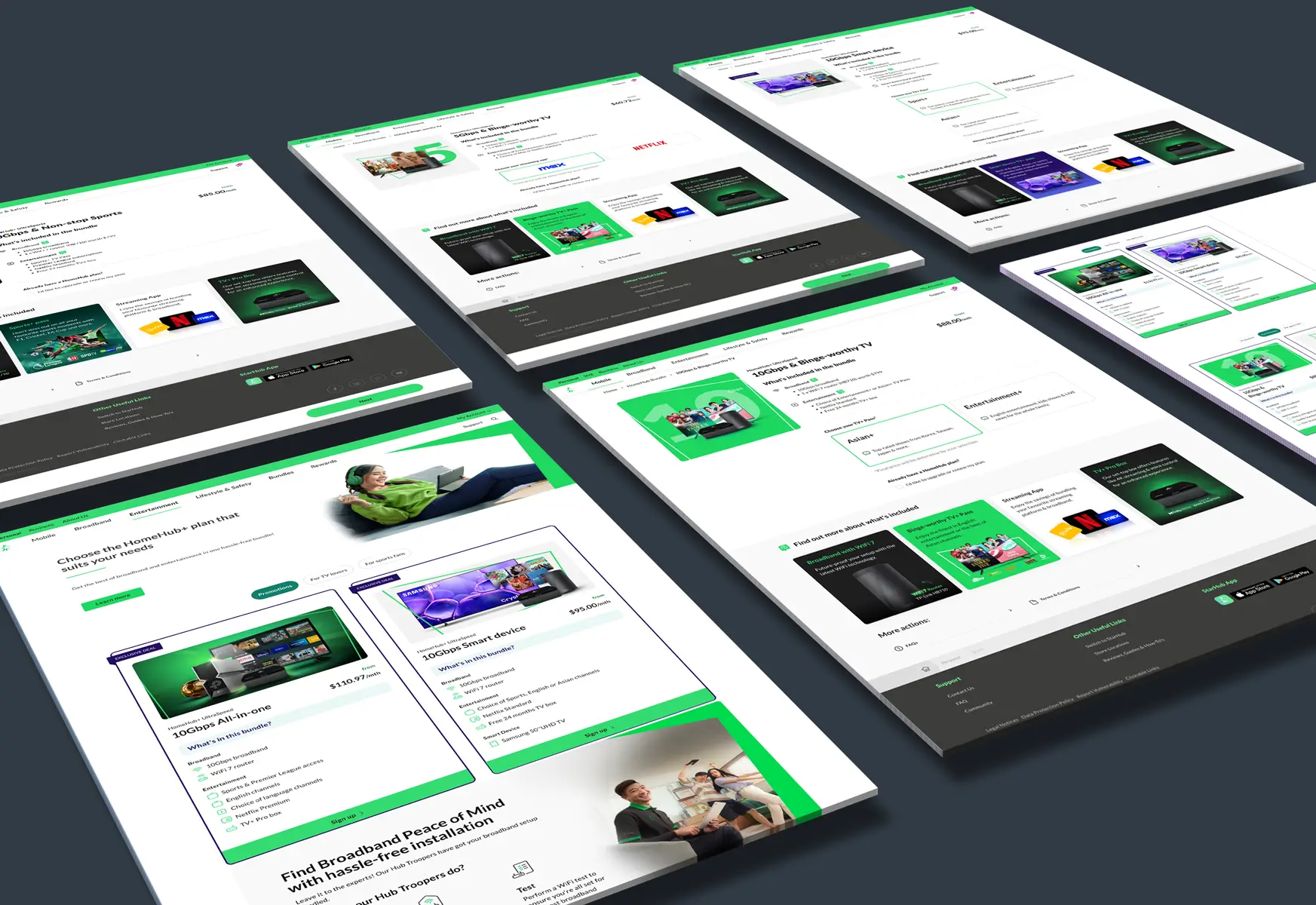
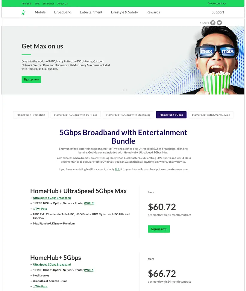
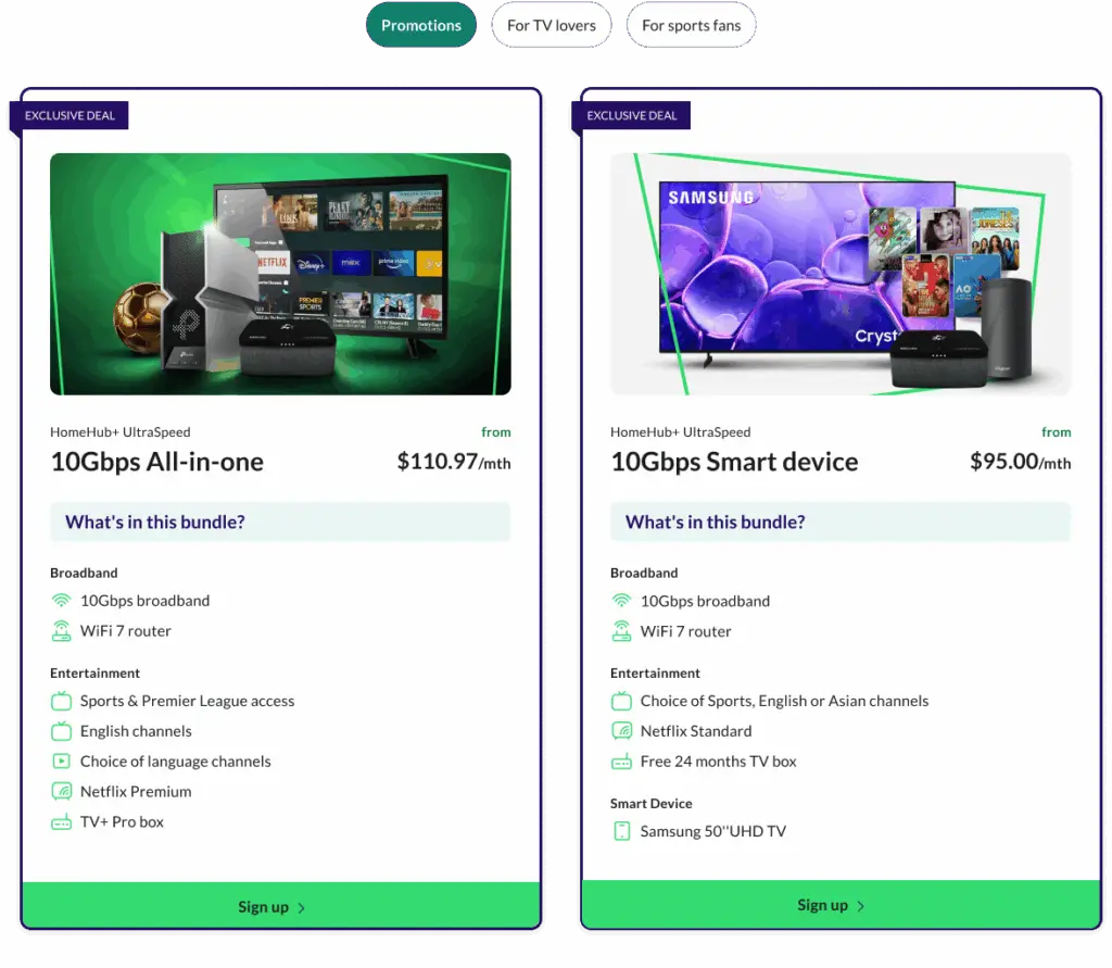
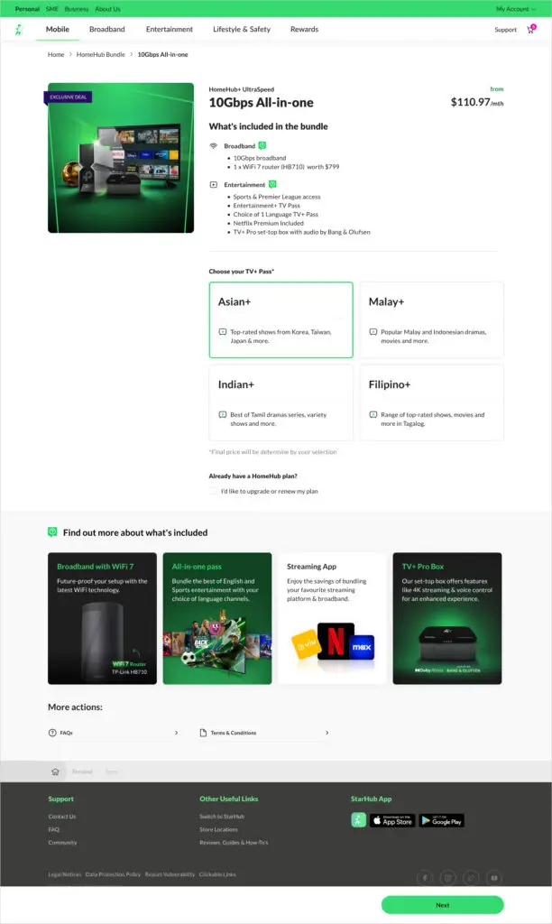
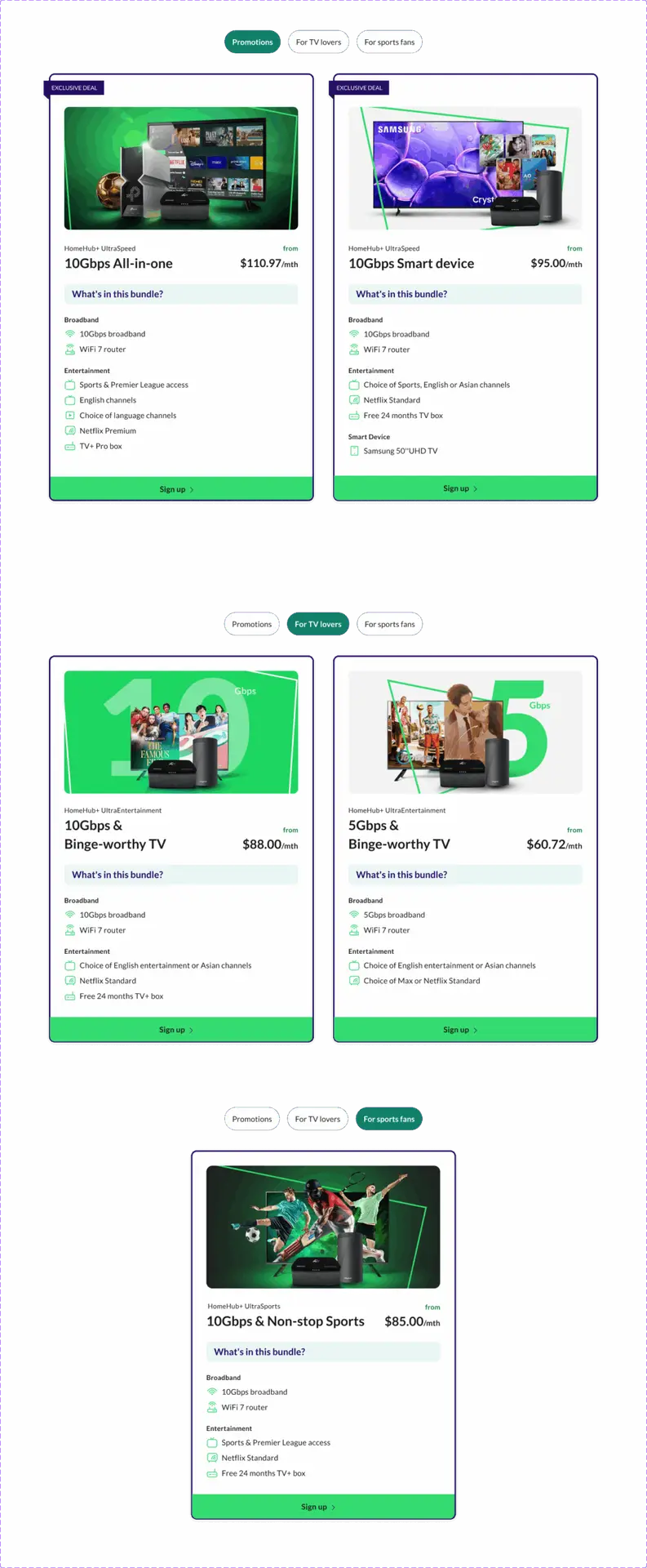
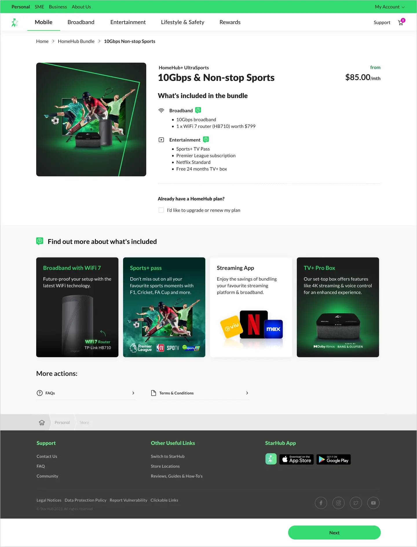
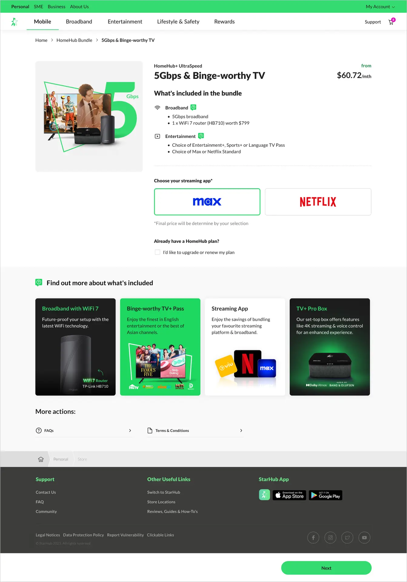
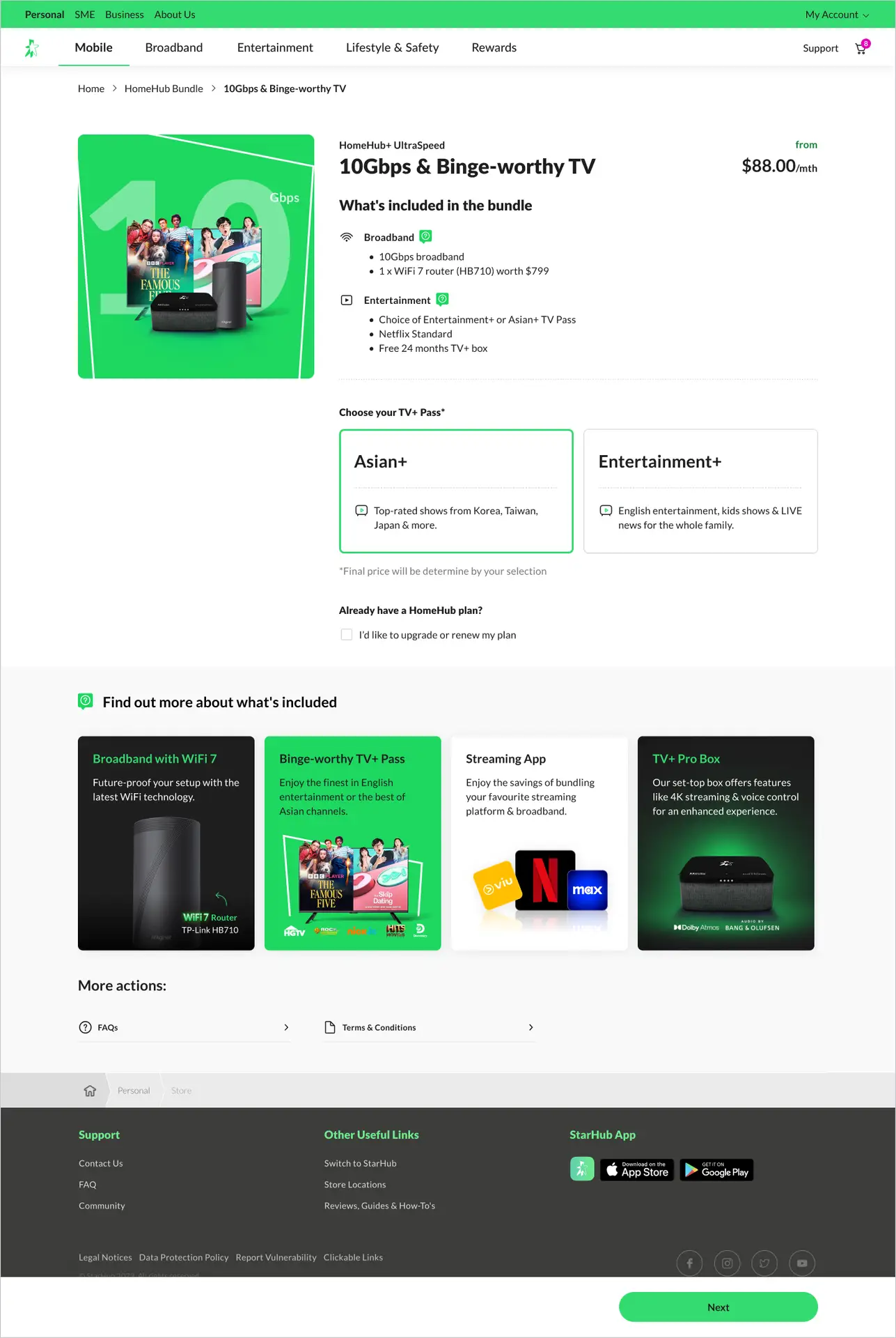
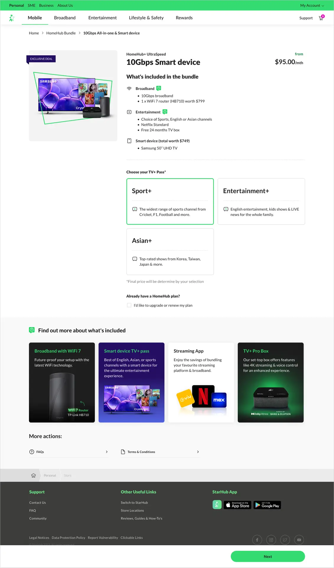
In our first round of user testing, we focused on two key areas: the categorization and naming of the bundles, as well as the layout and presentation of the plan cards and details.
Key Findings:
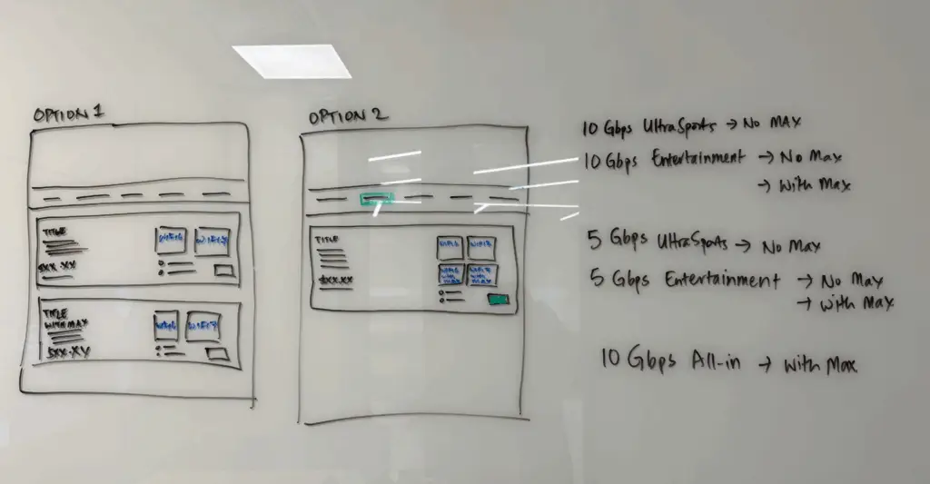
Participants frequently scrolled up and down in an effort to compare bundles, signaling that the differences between them weren’t immediately clear. Many users struggled to identify what made one bundle better than another. Highlighting unique benefits or free add-ons could better appeal to value-conscious users. In the case of Option A, most participants based their decisions primarily on the bundle names, indicating that the current structure does not effectively communicate the value or distinguishing features of each plan.
How Much is too Much Info? (UT #2)
Building on the insights from User Testing #1, we aimed to further simplify the page and set out to explore two key questions:
– What is the right balance between too much and too little information on the initial view?
– Would breaking the flow into two concise, focused pages improve clarity and decision-making?
Recommendations
After the second round of user testing, we incorporated the feedback and refined our approach into a final set of recommendations:
– Category Naming: We streamlined the bundle categories to three clear and relatable labels: Promotions, For TV Lovers, and For Sports Fans.
– Page Structure: We decided to split the experience into two screens. The first is a simplified landing page featuring plan cards with just the right amount of key information to encourage users to click through and explore further details on the next screen.
Recommendations
The second screen is designed to present bundle options in a clear, streamlined format, emphasizing key differences to support quicker, more confident decision-making.
To enhance understanding without disrupting the purchase flow, we also included a compact information carousel at the bottom of the page—offering visual highlights of key features included in the bundles.
Final Thoughts
Through two rounds of user testing and iterative design, we uncovered clear opportunities to improve how broadband and entertainment bundles are presented. Users prioritized price, familiarity with services, and ease of comparison, but struggled with unclear bundle differences and overwhelming information. Our refinements—such as simplifying category names, improving plan card layouts, and splitting the journey into two focused screens—were directly shaped by these insights. The addition of a bottom-page carousel also allowed us to surface supporting feature information without interrupting the buying flow.
Moving forward, we plan to validate these final designs through A/B testing and performance tracking once live. Key metrics will include engagement with the new layout, click-through rates from the initial landing page, improving on the pre-cart abandonment rate and overall bundle conversion rates. We’ll also continue monitoring qualitative feedback to ensure the experience remains aligned with customer needs as offerings evolve. Ultimately, this approach will serve as a scalable foundation for future bundle types and cross-sell opportunities.
Screens