Additional Projects
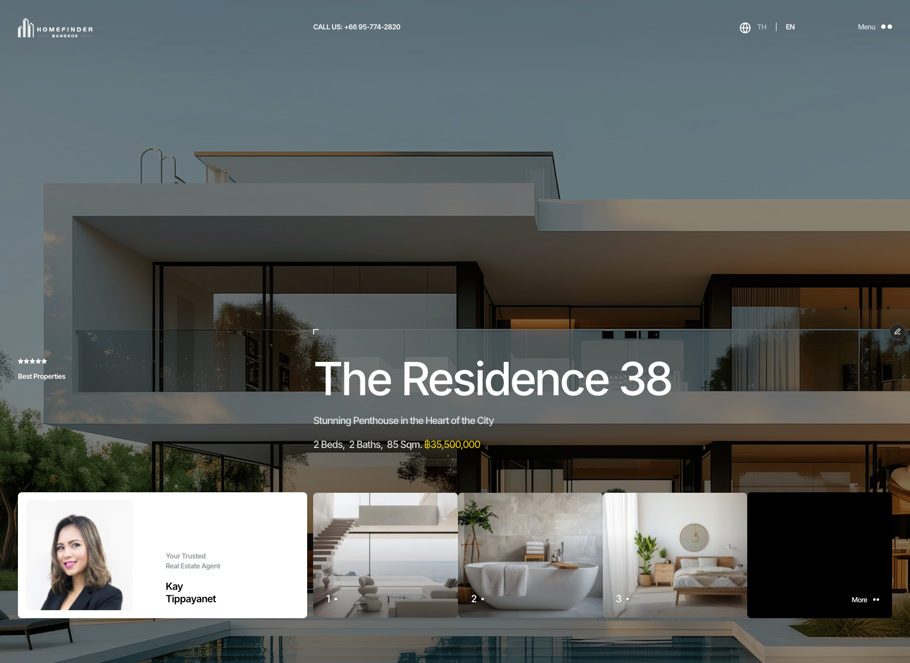
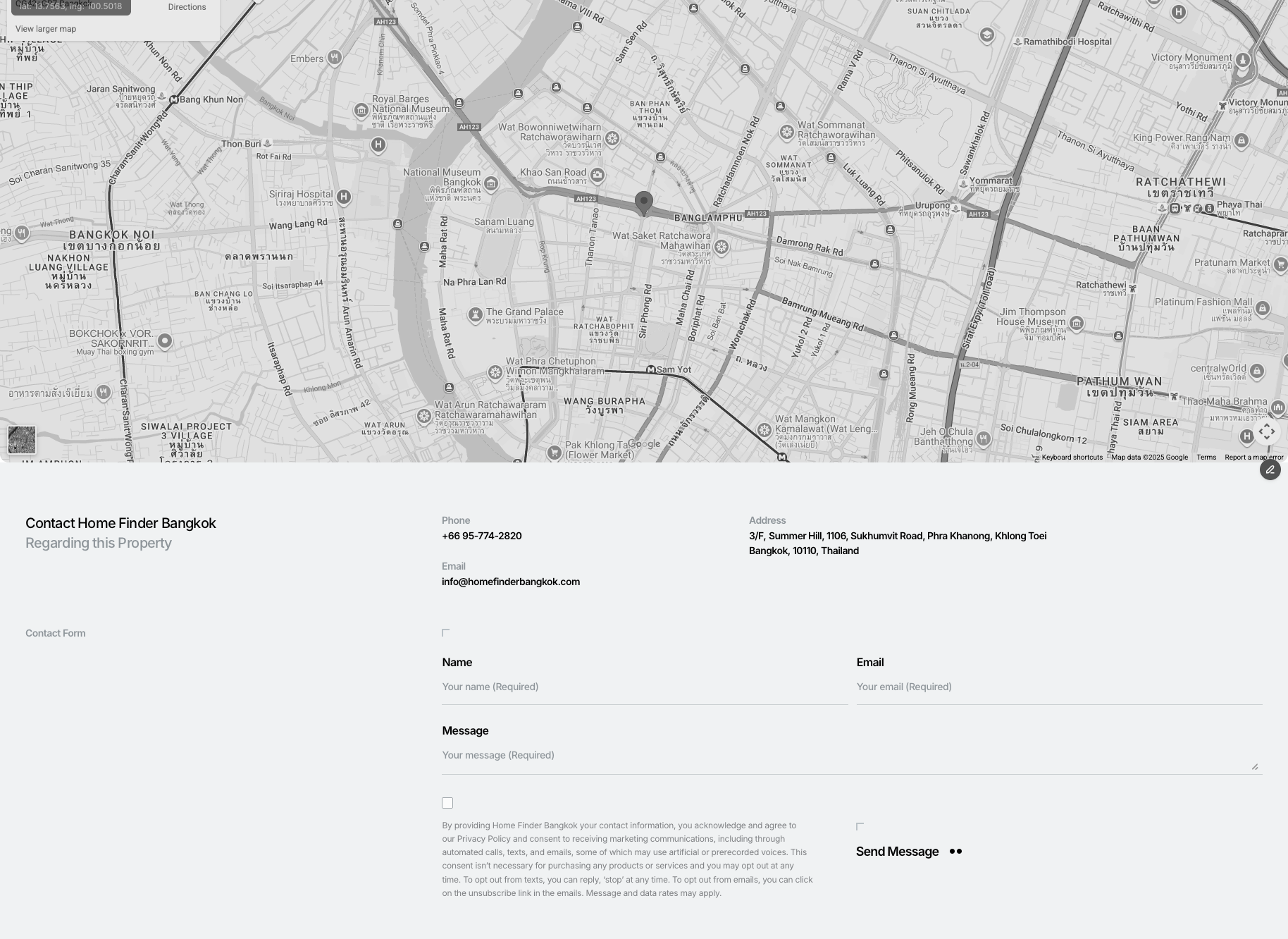
Home Finder Bangkok Real Estate Site Redesign
For HomeFinder Bangkok, I led the redesign and implementation of a modern real estate platform using Framer, transforming a legacy WordPress site into a visually refined, performance-focused experience. I structured a flexible CMS system to support diverse property data, designed intuitive search and filtering interactions, and optimised layouts for responsive performance across desktop and mobile. By combining UX strategy with Framer-based development and iterative testing, the project delivered clearer property discovery, improved visual consistency, and a scalable foundation for future enhancements.
Case Study Coming Soon…
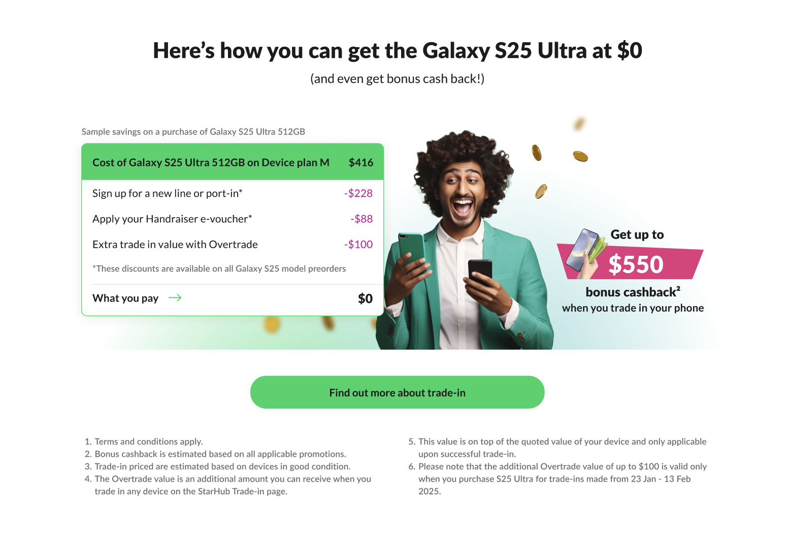
Samsung Galaxy S25 — Digital Launch Experience
I was appointed to lead the digital launch of the Samsung Galaxy S25, driving the experience strategy and creative execution for one of Samsung’s most important product moments of the year. Partnering with stakeholders across business, marketing, and digital teams, I led a multidisciplinary group of designers to define and deliver a cohesive launch journey that brought the Galaxy S25 narrative to life through high-impact digital touchpoints.
The scope included designing the full launch ecosystem across web and native app, including the Galaxy S25 launch microsite and a series of supporting digital flows (exploration, feature deep-dives, and purchase-oriented pathways). The result was a premium, brand-aligned digital experience built to scale across platforms—ensuring customers encountered a consistent and compelling story from first impression through conversion.
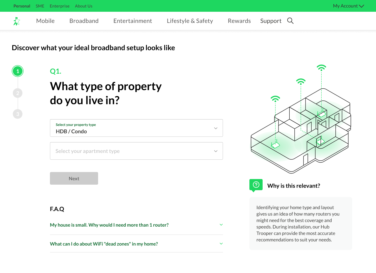
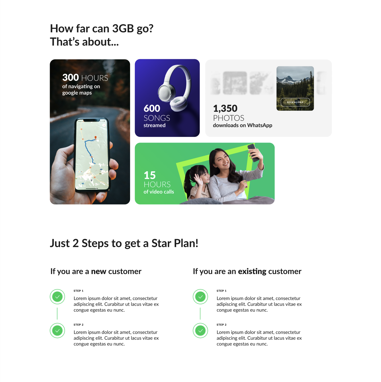
Broadband Plan Recommender (3-Step Guided Experience)
At StarHub, choosing a broadband service can be a confusing and overwhelming experience for many customers—especially when they’re expected to understand technical concepts like broadband speeds, router placement, WiFi coverage, and the differences between WiFi 6 and WiFi 7. To simplify this journey and reduce decision anxiety, I led the design of a 3-step guided broadband recommender experience that asked customers a small set of clear, everyday questions (e.g., home type, fibre point location, number of heavy internet users) to quickly understand their needs without requiring technical knowledge.
Based on the responses, the experience generated an ideal setup recommendation and surfaced the most suitable broadband packages, including guidance on router quantity, coverage considerations for multi-storey homes, and what to expect during installation. The solution was designed to work seamlessly across both web and mobile app, transforming a traditionally complex selection process into a structured, confidence-building journey that improved clarity and helped customers choose the right plan faster.
Holy AI WebAPP
HOLY is a web-based AI interface platform designed to simplify how users interact with multiple large multimodal models through a single, intelligent workflow. It intelligently routes user goals to the most suitable AI models — such as GPT, Claude, Leonardo, and others — while offering features like smart model recommendations, workflow chaining, and a unified output experience. Built with a strong focus on clarity, usability, and efficiency, HOLY transforms complex AI processes into a seamless, design-led interface that empowers users to achieve better results without needing technical expertise.
Case Study Coming Soon…
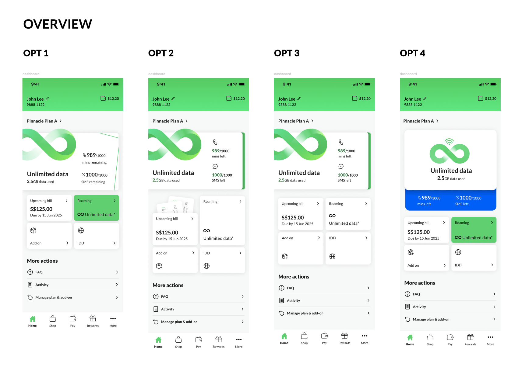
New Mobile Plans Dashboard
New Mobile Plans Dashboard is a complete redesign of an existing mobile account interface that previously suffered from poor clarity, excessive navigation steps, and confusing information hierarchy. Through three rounds of user testing, extensive global competitive analysis, and deep evaluation of user behaviour metrics, I restructured the dashboard to provide users with an instant, intuitive overview of their mobile plan status, usage, billing, and key actions. The new flow simplifies decision-making, reduces friction, and delivers a clearer, more confidence-driven experience that allows users to understand and manage their account at a glance.
Case Study Coming Soon…
Main Mobile Plans Page Redesign
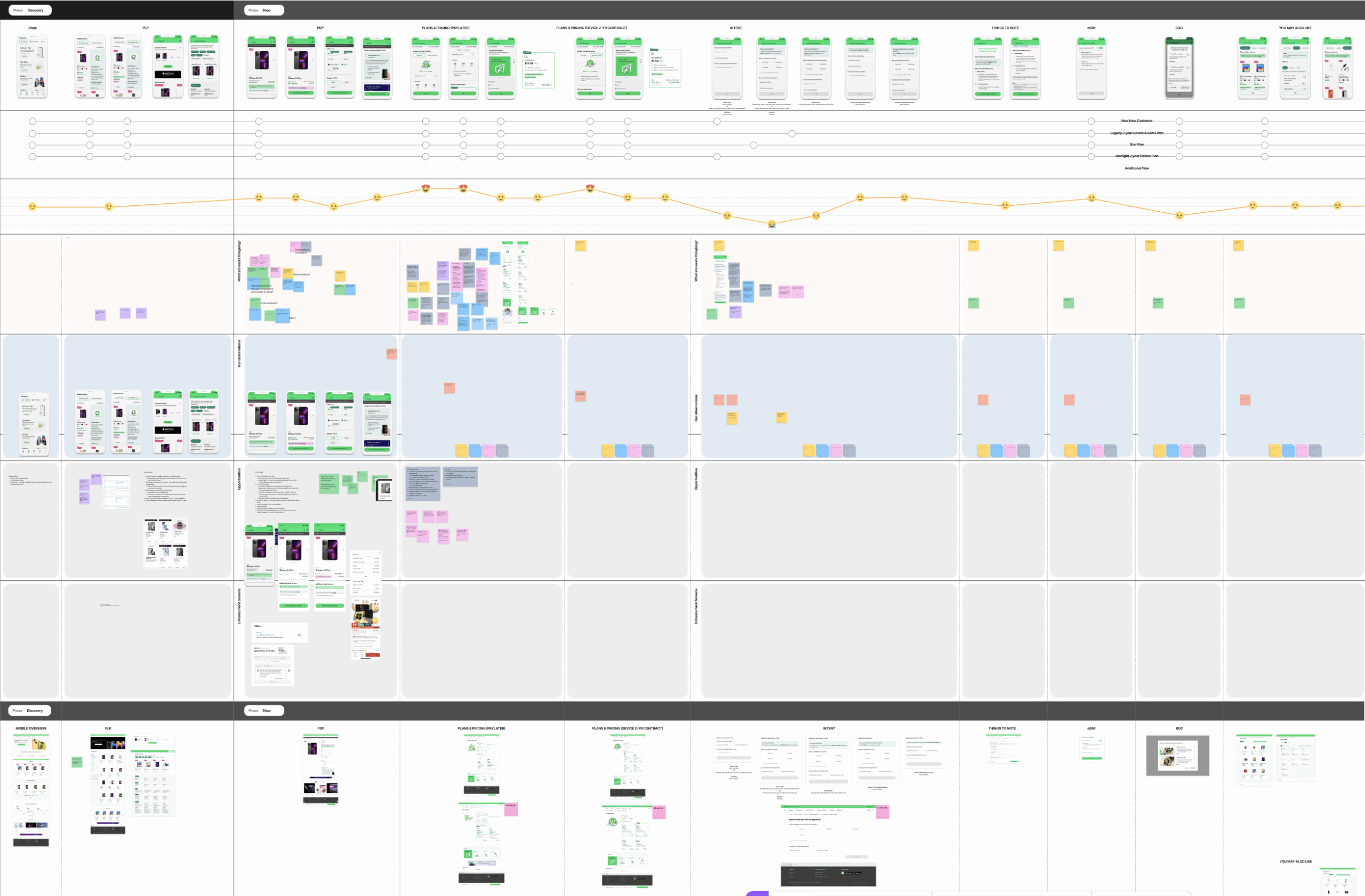
This project focused on redesigning the main mobile plan page to address high funnel drop-off and improve user progression to the next stage of the purchase journey. The existing page lacked clarity in content structure, visual hierarchy, and call-to-action prominence, which created friction and hesitation for users. I restructured the layout to prioritise key information, strengthen visual flow, and guide users more confidently toward plan selection and conversion through clearer messaging and more strategic CTA placement.
The work involved a deep analysis of the existing funnel performance, mapping a comprehensive end-to-end customer buying journey for mobile plans, and identifying key drop-off points. Through user research, usability testing, and multiple rounds of stakeholder alignment, the redesigned solution balanced business objectives with user needs, resulting in a more intuitive, conversion-focused experience that supported smoother decision-making and stronger engagement.
Case Study Coming Soon…